
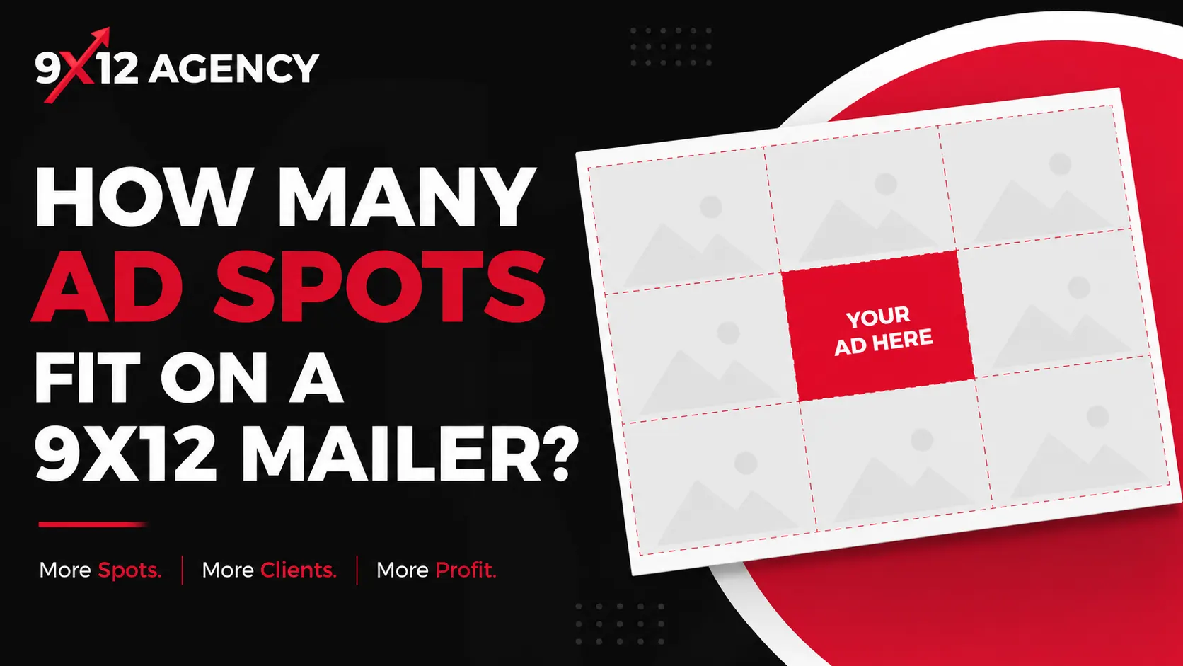
Every 9x12 agency owner asks the same question — how many ad spots fit on a 9x12 mailer, and should you sell more spots at a lower price or fewer at a premium? The answer shapes your revenue, your design, and how hard the card is to sell. Here’s how the common layouts compare and how to choose.
The Standard Layouts
16–24 spots (business-card size) — the classic co-op card
Both sides used, each spot roughly business-card sized. This is the layout most people picture when they hear “9x12 co-op card.”
- Revenue example: 24 spots × $300 = $7,200 per mailing
- Pros: highest total revenue; lower price point is an easy first yes for local businesses
- Cons: most selling effort (more advertisers to close); design needs discipline to avoid clutter
10–12 spots — the balanced card
Larger spots, more visual breathing room, often with one featured placement on the front.
- Revenue example: 12 spots × $450 = $5,400
- Pros: easier to fill; each advertiser gets real visibility; cleaner design
- Cons: higher per-spot price needs a slightly stronger pitch
6–8 spots — the premium card
Quarter-page-style ads for businesses with bigger budgets (home services, medical, real estate).
- Revenue example: 8 spots × $750 = $6,000
- Pros: only eight conversations to a full card; ads look like magazine placements
- Cons: smaller pool of advertisers who’ll pay premium rates; losing one spot hurts more
Mixing Spot Sizes: The Revenue Multiplier
The highest-earning cards usually aren’t uniform grids. A proven pattern:
- 1–2 double spots at 1.75–2× base price (anchor advertisers)
- a majority of standard spots at base price
- 2–4 premium positions (front face, corners) at +20–30%
Two merged singles selling as a double is also a graceful fallback: if nobody buys the double, sell it as two standards. Our ad-layout templates are built around these configurations, and full pricing strategy is covered in the pricing guide.
Design Rules That Keep 24 Spots From Looking Like Chaos
- Hard grid, consistent gutters. Every spot snaps to the same grid; even 24 ads look organized when spacing is uniform.
- One card-wide headline. A strong local hook (“Save Local — Springfield’s Coupon Card”) unifies the design and gives every ad borrowed attention.
- Category diversity. One advertiser per industry keeps the card useful to the homeowner and lets you sell exclusivity.
- QR codes on every spot. They give advertisers measurable results — the foundation of the rebook conversation — and tools like the 9x12 Agency CRM generate and track a unique QR per slot automatically.
Which Layout Should You Start With?
For a first campaign, the 10–12 spot card is the sweet spot: enough revenue to be meaningful, few enough advertisers that you can fill it in 2–4 weeks of focused selling (see how to sell ad spots). Once you have a track record and a waitlist, move to 16–24 spots or run both formats in different neighborhoods. All of these layouts are included as editable Canva files in the starter bundle.
Next read: 9x12 postcard size, paper and USPS EDDM specs
→ Build your layout and sell every spot online with 9x12 CRM — free to start.
